reading-notes
Module 1 - Create machine learning models
Train and evaluate classification models
What is classification?
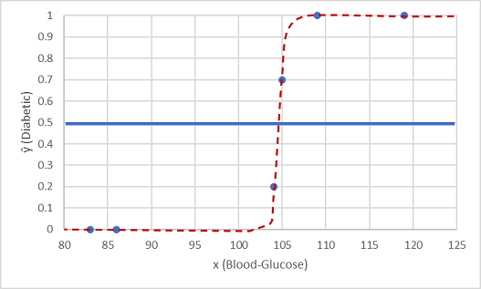
Binary classification is classification with two categories. The class prediction is made by determining the probability for each possible class as a value between 0 (impossible) and 1 (certain). A threshold value, usually 0.5, is used to determine the predicted class - so if the positive class has a predicted probability greater than the threshold, then a classification is predicted.
Classification is an example of a supervised machine learning technique, which means it relies on data that includes known feature values as well as known label values.
One such function is a logistic function, which forms a sigmoidal (S-shaped) curve, like this:
Load the dataset, separate the features and labels, compare the distribution for each label value, split the data into training and testing sets, train the binary classification model, evaluate how well it predicts and check the accuracy.
  import pandas as pd
  from sklearn.model_selection import train_test_split
  from sklearn.linear_model import LogisticRegression
  from sklearn.metrics import accuracy_score
  from matplotlib import pyplot as plt
  %matplotlib inline

  # load the training dataset
  !wget https://raw.githubusercontent.com/MicrosoftDocs/mslearn-introduction-to-machine-learning/main/Data/ml-basics/diabetes.csv
  diabetes = pd.read_csv('diabetes.csv')
  diabetes.head()

  # Separate features and labels
  features = ['Pregnancies','PlasmaGlucose','DiastolicBloodPressure','TricepsThickness','SerumInsulin','BMI','DiabetesPedigree','Age']
  label = 'Diabetic'
  X, y = diabetes[features].values, diabetes[label].values

  for n in range(0,4):
      print("Patient", str(n+1), "\n  Features:",list(X[n]), "\n  Label:", y[n])

  # compare the feature distributions for each label value
  features = ['Pregnancies','PlasmaGlucose','DiastolicBloodPressure','TricepsThickness','SerumInsulin','BMI','DiabetesPedigree','Age']
  for col in features:
      diabetes.boxplot(column=col, by='Diabetic', figsize=(6,6))
      plt.title(col)
  plt.show()

  # Split data 70%-30% into training set and test set
  X_train, X_test, y_train, y_test = train_test_split(X, y, test_size=0.30, random_state=0)

  print ('Training cases: %d\nTest cases: %d' % (X_train.shape[0], X_test.shape[0]))

  # Set regularization rate
  reg = 0.01

  # train a logistic regression model on the training set
  model = LogisticRegression(C=1/reg, solver="liblinear").fit(X_train, y_train)
  print (model)

  # use the test data we held back to evaluate how well it predicts
  predictions = model.predict(X_test)
  print('Predicted labels: ', predictions)
  print('Actual labels:    ' ,y_test)

  # check the accuracy of the predictions
  print('Accuracy: ', accuracy_score(y_test, predictions))
The accuracy is returned as a decimal value - a value of 1.0 would mean that the model got 100% of the predictions right; while an accuracy of 0.0 is useless.
Evaluate classification models
The training accuracy of a classification model is much less important than how well that model will work when given new, unseen data. Simply calculating how many predictions were correct is sometimes misleading or too simplistic for us to understand the kinds of errors it will make in the real world. To get more detailed information, we can tabulate the results in a structure called a confusion matrix.
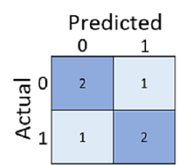
The confusion matrix shows the total number of cases where:
- The model predicted 0 and the actual label is 0 (true negatives; top left)
- The model predicted 1 and the actual label is 1 (true positives; bottom right)
- The model predicted 0 and the actual label is 1 (false negatives; bottom left)
- The model predicted 1 and the actual label is 0 (false positives; top right)
From these core values, you can calculate a range of other metrics that can help you evaluate the performance of the model:
- Accuracy: (TP+TN)/(TP+TN+FP+FN) - out all of the predictions, how many were correct?
- Recall: TP/(TP+FN) - of all the cases that are positive, how many did the model identify?
- Precision: TP/(TP+FP) - of all the cases that the model predicted to be positive, how many actually are positive?
- F1-Score: An average metric that takes both precision and recall into account.
- Support: How many instances of this class are there in the test dataset?
One of the simplest places to start is a classification report. Run the next cell to see a range of alternatives ways to assess our model. You can also retrieve precision and recall values on their own by using the precision_score and recall_score metrics in scikit-learn (which by default assume a binary classification model).
  from sklearn. metrics import classification_report, precision_score, recall_score

  print(classification_report(y_test, predictions))

  print("Overall Precision:",precision_score(y_test, predictions))
  print("Overall Recall:",recall_score(y_test, predictions))
You can use the sklearn.metrics.confusion_matrix function to find the four possible prediction outcomes for a trained classifier by creating a confusion matrix.
  from sklearn.metrics import confusion_matrix

  # Print the confusion matrix
  cm = confusion_matrix(y_test, predictions)
  print (cm)
You can use the predict_proba method to see the probability pairs for each case.
  y_scores = model.predict_proba(X_test)
  print(y_scores)
A common way to evaluate a classifier is to examine the true positive rate (which is another name for recall) and the false positive rate for a range of possible thresholds. These rates are then plotted against all possible thresholds to form a chart known as a received operator characteristic (ROC)* chart.
The ROC chart shows the curve of the true and false positive rates for different threshold values between 0 and 1. A perfect classifier would have a curve that goes straight up the left side and straight across the top. The diagonal line across the chart represents the probability of predicting correctly with a 50/50 random prediction; so you obviously want the curve to be higher than that.
The area under the curve (AUC) is a value between 0 and 1 that quantifies the overall performance of the model. The closer to 1 this value is, the better the model.
  from sklearn.metrics import roc_curve
  from sklearn.metrics import confusion_matrix
  from sklearn.metrics import roc_auc_score
  import matplotlib
  import matplotlib.pyplot as plt
  %matplotlib inline

  # calculate ROC curve
  fpr, tpr, thresholds = roc_curve(y_test, y_scores[:,1])

  # plot ROC curve
  fig = plt.figure(figsize=(6, 6))
  # Plot the diagonal 50% line
  plt.plot([0, 1], [0, 1], 'k--')
  # Plot the FPR and TPR achieved by our model
  plt.plot(fpr, tpr)
  plt.xlabel('False Positive Rate')
  plt.ylabel('True Positive Rate')
  plt.title('ROC Curve')
  plt.show()

  auc = roc_auc_score(y_test,y_scores[:,1])
  print('AUC: ' + str(auc))
In practice, it’s common to perform some preprocessing of the data to make it easier for the algorithm to fit a model to it. There’s a huge range of preprocessing transformations you can perform to get your data ready for modeling, but we’ll limit ourselves to a few common techniques: scaling numeric features and encoding categorical variables (one hot encoding). To apply these preprocessing transformations, we’ll make use of a Scikit-Learn feature named pipelines.
  # Train the model
  from sklearn.compose import ColumnTransformer
  from sklearn.pipeline import Pipeline
  from sklearn.preprocessing import StandardScaler, OneHotEncoder
  from sklearn.linear_model import LogisticRegression
  import numpy as np

  # Define preprocessing for numeric columns (normalize them so they're on the same scale)
  numeric_features = [0,1,2,3,4,5,6]
  numeric_transformer = Pipeline(steps=[
      ('scaler', StandardScaler())])

  # Define preprocessing for categorical features (encode the Age column)
  categorical_features = [7]
  categorical_transformer = Pipeline(steps=[
      ('onehot', OneHotEncoder(handle_unknown='ignore'))])

  # Combine preprocessing steps
  preprocessor = ColumnTransformer(
      transformers=[
          ('num', numeric_transformer, numeric_features),
          ('cat', categorical_transformer, categorical_features)])

  # Create preprocessing and training pipeline
  pipeline = Pipeline(steps=[('preprocessor', preprocessor),
                            ('logregressor', LogisticRegression(C=1/reg, solver="liblinear"))])


  # fit the pipeline to train a logistic regression model on the training set
  model = pipeline.fit(X_train, (y_train))
  print (model)
This time, we’ll use the same preprocessing steps as before, but we’ll train the model using an ensemble algorithm named Random Forest that combines the outputs of multiple random decision trees.
  from sklearn.ensemble import RandomForestClassifier

  # Create preprocessing and training pipeline
  pipeline = Pipeline(steps=[('preprocessor', preprocessor),
                            ('logregressor', RandomForestClassifier(n_estimators=100))])

  # fit the pipeline to train a random forest model on the training set
  model = pipeline.fit(X_train, (y_train))
  print (model)
We can look at the performance of either previous models using:
  predictions = model.predict(X_test)
  y_scores = model.predict_proba(X_test)
  cm = confusion_matrix(y_test, predictions)
  print ('Confusion Matrix:\n',cm, '\n')
  print('Accuracy:', accuracy_score(y_test, predictions))
  print("Overall Precision:",precision_score(y_test, predictions))
  print("Overall Recall:",recall_score(y_test, predictions))
  auc = roc_auc_score(y_test,y_scores[:,1])
  print('\nAUC: ' + str(auc))

  # calculate ROC curve
  fpr, tpr, thresholds = roc_curve(y_test, y_scores[:,1])

  # plot ROC curve
  fig = plt.figure(figsize=(6, 6))
  # Plot the diagonal 50% line
  plt.plot([0, 1], [0, 1], 'k--')
  # Plot the FPR and TPR achieved by our model
  plt.plot(fpr, tpr)
  plt.xlabel('False Positive Rate')
  plt.ylabel('True Positive Rate')
  plt.title('ROC Curve')
  plt.show()
Create multiclass clasification models
Multiclass classification can be thought of as a combination of multiple binary classifiers. There are two ways in which you approach the problem:
- One vs Rest (OVR) - a classifier is created for each possible class value, with a positive outcome for cases where the prediction is this class, and negative predictions for cases where the prediction is any other class.
- One vs One (OVO) - a classifier for each possible pair of classes is created.
In both approaches, the overall model must take into account all of these predictions to determine which single category the item belongs to.
  import pandas as pd
  import numpy as np
  from sklearn.model_selection import train_test_split
  from sklearn.linear_model import LogisticRegression
  from sklearn.metrics import accuracy_score, precision_score, recall_score, roc_curve, roc_auc_score
  from matplotlib import pyplot as plt
  %matplotlib inline

  # load the training dataset
  !wget https://raw.githubusercontent.com/MicrosoftDocs/mslearn-introduction-to-machine-learning/main/Data/ml-basics/penguins.csv
  penguins = pd.read_csv('penguins.csv')

  penguin_classes = ['Adelie', 'Gentoo', 'Chinstrap']
  print(sample.columns[0:5].values, 'SpeciesName')
  for index, row in penguins.sample(10).iterrows():
      print('[',row[0], row[1], row[2], row[3], int(row[4]),']',penguin_classes[int(row[4])])

  # Drop rows containing NaN values
  penguins=penguins.dropna()
  #Confirm there are now no nulls
  penguins.isnull().sum()

  # create some box charts
  penguin_features = ['CulmenLength','CulmenDepth','FlipperLength','BodyMass']
  penguin_label = 'Species'
  for col in penguin_features:
      penguins.boxplot(column=col, by=penguin_label, figsize=(6,6))
      plt.title(col)
  plt.show()

  # Separate features and labels
  penguins_X, penguins_y = penguins[penguin_features].values, penguins[penguin_label].values

  # Split data 70%-30% into training set and test set
  x_penguin_train, x_penguin_test, y_penguin_train, y_penguin_test = train_test_split(penguins_X, penguins_y,
                                                                                      test_size=0.30,
                                                                                      random_state=0,
                                                                                      stratify=penguins_y)

  print ('Training Set: %d, Test Set: %d \n' % (x_penguin_train.shape[0], x_penguin_test.shape[0]))

  # Set regularization rate
  reg = 0.1

  # train a logistic regression model on the training set
  multi_model = LogisticRegression(C=1/reg, solver='lbfgs', multi_class='auto', max_iter=10000).fit(x_penguin_train, y_penguin_train)
  print (multi_model)

  # predict the labels for the test features and compare labels
  penguin_predictions = multi_model.predict(x_penguin_test)
  print('Predicted labels: ', penguin_predictions[:15])
  print('Actual labels   : ' ,y_penguin_test[:15])

  # get precision and recall by specifying which average metric to use
  print("Overall Accuracy:",accuracy_score(y_penguin_test, penguin_predictions))
  print("Overall Precision:",precision_score(y_penguin_test, penguin_predictions, average='macro'))
  print("Overall Recall:",recall_score(y_penguin_test, penguin_predictions, average='macro'))

  # When dealing with multiple classes, it's generally more intuitive to visualize this as a heat map than a confusion matrix
  plt.imshow(mcm, interpolation="nearest", cmap=plt.cm.Blues)
  plt.colorbar()
  tick_marks = np.arange(len(penguin_classes))
  plt.xticks(tick_marks, penguin_classes, rotation=45)
  plt.yticks(tick_marks, penguin_classes)
  plt.xlabel("Predicted Species")
  plt.ylabel("Actual Species")
  plt.show()

  # Get class probability scores
  penguin_prob = multi_model.predict_proba(x_penguin_test)

  # Get ROC metrics for each class
  fpr = {}
  tpr = {}
  thresh ={}
  for i in range(len(penguin_classes)):
      fpr[i], tpr[i], thresh[i] = roc_curve(y_penguin_test, penguin_prob[:,i], pos_label=i)

  # Plot the ROC chart
  plt.plot(fpr[0], tpr[0], linestyle='--',color='orange', label=penguin_classes[0] + ' vs Rest')
  plt.plot(fpr[1], tpr[1], linestyle='--',color='green', label=penguin_classes[1] + ' vs Rest')
  plt.plot(fpr[2], tpr[2], linestyle='--',color='blue', label=penguin_classes[2] + ' vs Rest')
  plt.title('Multiclass ROC curve')
  plt.xlabel('False Positive Rate')
  plt.ylabel('True Positive rate')
  plt.legend(loc='best')
  plt.show()

  # quantify the ROC performance
  auc = roc_auc_score(y_penguin_test,penguin_prob, multi_class='ovr')
  print('Average AUC:', auc)
Again, just like with binary classification, you can use a pipeline to apply preprocessing steps to the data before fitting it to an algorithm to train a model. Let’s see if we can improve the penguin predictor by scaling the numeric features in a transformation steps before training. We’ll also try a different algorithm (a support vector machine).
  from sklearn.preprocessing import StandardScaler
  from sklearn.compose import ColumnTransformer
  from sklearn.pipeline import Pipeline
  from sklearn.svm import SVC

  # Define preprocessing for numeric columns (scale them)
  feature_columns = [0,1,2,3]
  feature_transformer = Pipeline(steps=[
      ('scaler', StandardScaler())
      ])

  # Create preprocessing steps
  preprocessor = ColumnTransformer(
      transformers=[
          ('preprocess', feature_transformer, feature_columns)])

  # Create training pipeline
  pipeline = Pipeline(steps=[('preprocessor', preprocessor),
                            ('regressor', SVC(probability=True))])


  # fit the pipeline to train a linear regression model on the training set
  multi_model = pipeline.fit(x_penguin_train, y_penguin_train)
  print (multi_model)
Summary
In this module, you learned how classification can be used to create a machine learning model that predicts categories, or classes. You then used the scikit-learn framework in Python to train and evaluate a classification model.
Source: Microsoft Learn